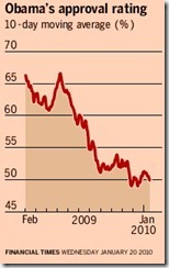
Three years ago I wrote a short piece on how the FT had misrepresented the ratings of President Obama by using an inappropriate vertical scale on a graph it was showing.
My simple suggestion was to elongate the vertical scale and reinterpret the graph.
I just reviewed that posting and feel I ought to have suggested that we calculate rates of change values for the ratings rather than just change the chart. That will give us a complete picture.
Here’s the original graph:
Here is my table of data: assumed values from the chart then calculated values of the rates of change. Finally my own graph showing both sets of numbers: look at the impact of the rates of change values!
| Year | Month | Change % | Rate of |
| 2009 | Feb | 66% | |
| 2009 | Mar | 63% | -4.55% |
| 2009 | Apr | 61% | -3.17% |
| 2009 | May | 64% | 4.92% |
| 2009 | Jun | 64% | -0.78% |
| 2009 | Jul | 60% | -5.51% |
| 2009 | Aug | 55% | -8.33% |
| 2009 | Sep | 52% | -5.45% |
| 2009 | Oct | 52% | 0.00% |
| 2009 | Nov | 52% | 0.00% |
| 2009 | Dec | 50% | -3.85% |
| 2010 | Jan | 51% | 2.00% |
Sorry the example is so old but it’s a good one because the rates of change are at such apparent odds with the way the chart was originally presented.
Duncan Williamson


No comments:
Post a Comment